Turning Drone Photos into a Working Land Design Map
We didn’t start with mapping. We started with water.
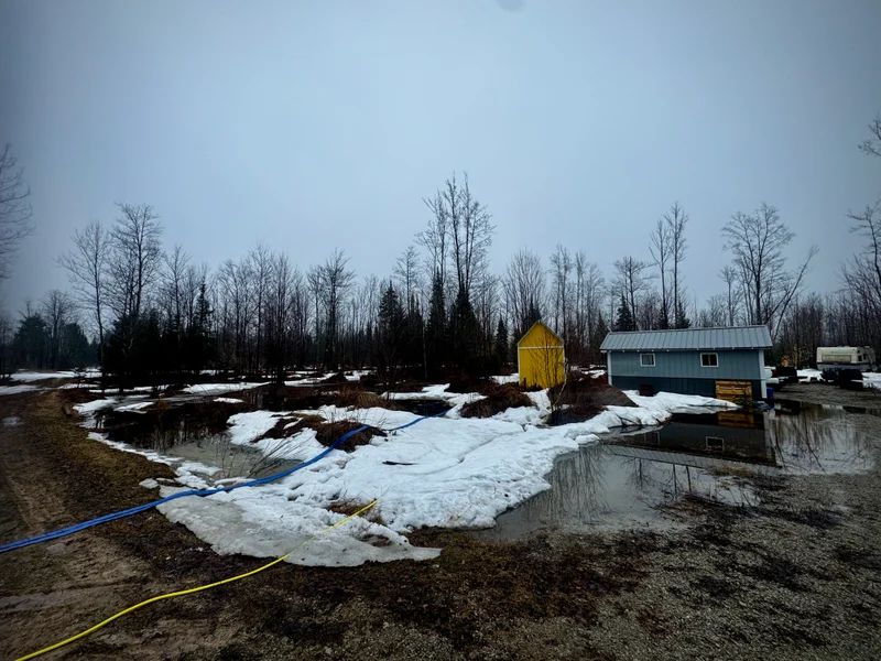
This project didn’t come from a tech angle. It came from standing on the property during a high-water event and trying to understand what was actually happening.
Snow was almost gone, everything was saturated, and the low spots were full of water. With no leaves on the trees, visibility was wide open. It was one of those moments where you know the land is showing you something—but you can’t quite read it from ground level.
We already knew a few things. Our driveway interrupts the water flow, but after a few years of driving on it, packing it, and adding gravel, it has become stable. Even when water runs over it, it’s not doing meaningful damage.
What we didn’t know was where the water actually sits when everything is maxed out. From ground level, movement and holding blur together once everything is saturated. That was the question: not where water moves in theory, but where it holds in reality.
We weren’t trying to model ideal flow paths or design anything yet. We were watching how the land behaves when it’s fully loaded with water and using that as a baseline. It’s easier to work with what’s already happening than to fight it later.
Capturing the land from above
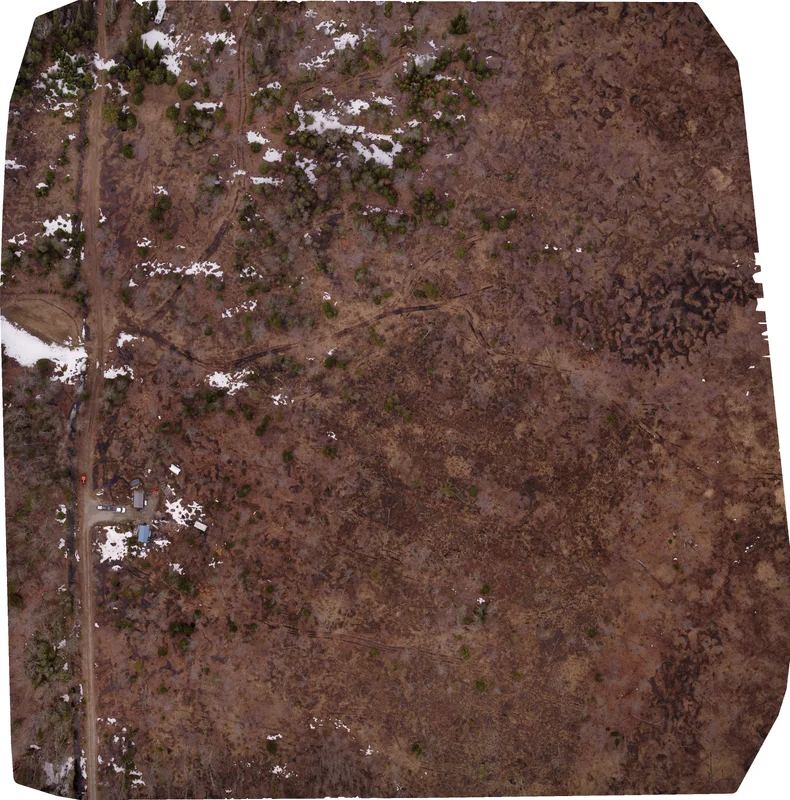
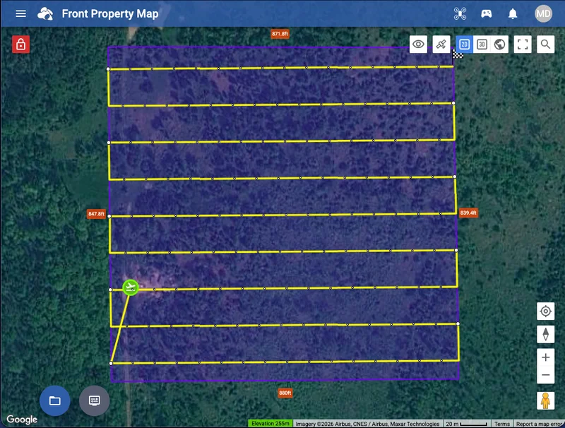
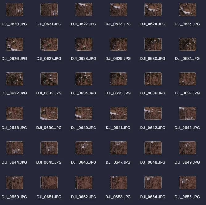
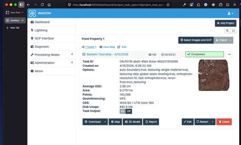
To answer that, I flew the property with my DJI Mini SE and captured 145 overlapping photos across roughly 15 acres.
The flight planning was done using Litchi App, which made it straightforward to set up a grid pattern with consistent overlap. Once the flight plan was dialed in, the flight itself was uneventful—which is exactly what you want.
I picked a low-wind, overcast day to keep lighting consistent and avoid harsh shadows. That alone made a big difference. Even lighting across images makes stitching cleaner and avoids visible seams.
Each image overlaps the next, giving the software enough shared reference points to align everything accurately. If the overlap is too low, you get gaps or distortion. Think of it like collecting puzzle pieces that eventually form one continuous image.
Stitching it together (and hitting limits)
The images were processed using WebODM, which turns those photos into a corrected aerial map tied to real-world scale. Instead of a stitched picture, you get something you can measure and use for planning.
This was the only point where things got tight. Stitching 145 images on a four-year-old M1 MacBook pushed the hardware. It forced me to pay attention to settings instead of just hitting run.
WebODM handled it well, but I leaned on lower-resource settings and its ability to resume after failure. That restart feature mattered—without it, the process would have been frustrating enough to abandon.
This process is accessible, but not frictionless. There’s still trial and error, especially with limited hardware.
Building a usable base map
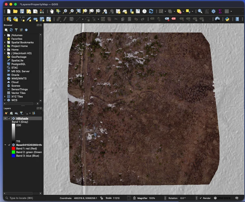
The output is an orthophoto: a stitched aerial image corrected for distortion so distances are accurate. That correction is what makes it usable, not just visual.
I exported it as a GeoTIFF, which means it carries location data and can align with other datasets like elevation and soil maps. Without that, it’s just an image.
This becomes the base layer. Everything else builds on top of it.
WebODM is what builds the map. It takes those overlapping drone images and turns them into a single corrected aerial image tied to real-world scale. That’s the heavy processing step, and it’s where the map is actually created from scratch.
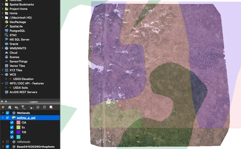
After that, we moved into QGIS. QGIS doesn’t build maps from photos—it’s where we start layering information and making sense of what we’re seeing. This is where we added elevation, soils, and wetland data to start revealing patterns across the property.
A simple way to think about it: WebODM builds the map, and QGIS turns it into something you can make decisions with. Keeping that separation clear makes the workflow easier and keeps you from chasing the wrong problem in the wrong tool.
Adding terrain context
On paper, our property has about 12 feet of elevation change, mostly on the back side. The working area is closer to 6–8 feet across the 15 acres, and is subtle enough to miss when walking.
That doesn’t sound like much, but with water, even inches matter. Those small differences determine whether water keeps moving or starts to pool.
Digital tracing paper
We stacked aerial imagery, elevation, soil, and wetland data. Each layer tells a different part of the story, but none of them stand alone.
Adjusting transparency and blending lets you see how those layers interact. It’s less about finding perfect settings and more about learning how to read what’s there.
This is the digital version of permaculture tracing paper. Once you start seeing patterns across layers, it becomes a working tool instead of just a map.
Taking it back to the field
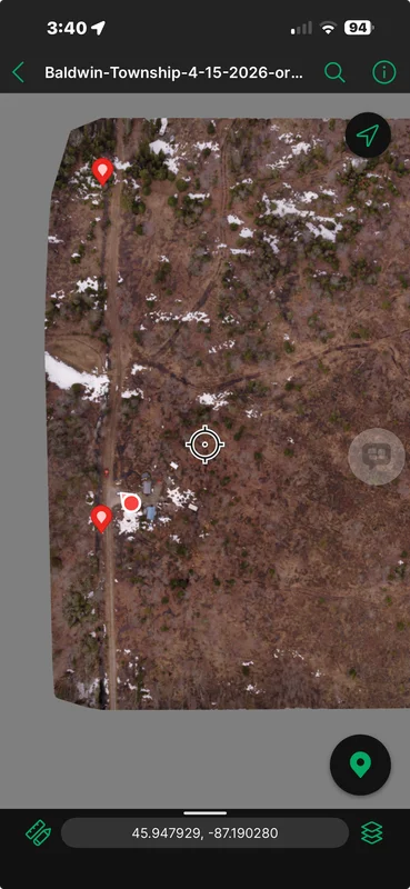
The final map was loaded into Avenza Maps, which lets you walk the property with GPS showing your position directly on the map.
You can stand in a wet spot or on a ridge and see exactly how it lines up with what you mapped. No internet required, everything is stored locally, so it’s always available when you need it.
This is where it shifts from interesting to useful. The map becomes something you carry and use, not just something you built on a screen.
What actually changed
The biggest shift wasn’t detail, it was clarity. The land started to read as a system instead of scattered observations.
We confirmed water leaves the property in two main directions and that our driveway isn’t a real problem. More importantly, we could clearly see where water holds during peak saturation. That’s the hardest thing to understand from ground level.
That feeds directly into bigger decisions.
• Pond placement
Where to place them, how they connect, and how to move water into those systems. The map shows how ponds can function together, not just individually.
• Road layout
Where access makes sense without fighting water long-term. Instead of placing roads based only on convenience, this helps us see how water actually behaves across the property and avoid routing through problem areas. It reduces the chances of creating low spots that turn into mud or erosion over time. The goal is to put roads where they naturally stay drier and require less maintenance instead of constantly correcting them later.
• Water consolidation
Instead of scattered shallow wet spots, the goal is to concentrate water into larger, more stable ponds. Smaller pockets tend to stagnateand breed mosquities; larger systems are easier to manage.
This likely means scooping material from pond areas and using it to fill smaller low spots. It’s reshaping the land using what’s already there.
This is a multi-year process. Each season gives feedback, and adjustments follow.
The map is excellent for big-picture planning—roads, ponds, general water flow direction. It helps you see patterns you can’t read from the ground, especially when the land feels flatter than it actually is. From above, those subtle shifts start to organize into something you can interpret and work with. It gives you a clearer starting point so your early decisions are based on patterns instead of guesswork.
It is not good for fine work like swales or precise water movement. At this scale, small elevation changes don’t show up clearly enough. That work still happens on the ground with simple tools.
The takeaway: I didn’t need more detailed data. I needed better context. Once that clicked, it was easier to stop chasing precision and start making decisions.
Where this goes next
Over the next couple of years, this map becomes a working tool. We’ll use it to sketch roads, identify pond locations, and plan our permaculture zones. It gives us a shared reference point so we’re not starting from scratch every time we walk the property. As conditions change, we can come back to it and adjust instead of guessing or relying on memory.
Some of that will happen digitally. Some will happen on printed maps with a pencil. Switching between the two helps us see different things and slow the thinking down when needed. That back-and-forth is what turns this from a one-time project into something we actually use.
The real takeaway
The goal isn’t perfect data. It reduces guesswork, allowing you to move forward with more confidence. There’s a point where chasing more detail doesn’t actually improve the decision; it just slows you down. Getting to a clear enough understanding is what matters.
If this process gets you 80–90% of the way there, and the rest comes from observation and hard work, that’s enough. That last portion is where the land teaches you what no map can show. You still need to walk it after a heavy rain, pay attention, and adjust based on what you see.
The land gets the final say. No matter how clean the data looks, real conditions will always have the last word. Plans will shift as you see how water actually behaves over time. The map supports the process, but it doesn’t replace your relationship with the land.